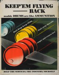
Friday, 9 November 2012

Making My Poster - The Text and Typography


After finding the font I wanted to use I wrote the text I wanted for my poster into illustrator I did a new layer for each line of text this way it would be easier to position correctly on my poster. After I had positioned the text I used the line tool to first create the lines linking the main slogan. 


Then I used the line tool to create the hash tag shape and resized it so it fitted into the text, but also kept the text readable here is what it looked like on the poster. 

I didn't want to put lines through actual text to make the hash tag as I thought the text would not be right and the hash tag would not be as clear. 


Here what the final text looked like after I changed the issues raised in my crit.

Poster After The Crit

Here is my poster after the crit - 


As you can see I have completely redone all of the typography on the poster which I now think is a lot stronger and works more than it did before, also I have added the gaussian blur effect to the black cloud shapes to give the overall imagery a bigger sense of movement. Overall I think these smal changes make my poster a lot better. 

Also I have not yet fixed the line issue for the twiiter birds but this should be done for my finished poster. 

Making My Poster - The Backgrounds

The first thing I wanted to do is recreate the background effects from the original poster because I wanted to use them in my own work. So the first one is the main paper background for the whole poster I wanted to use this in my work as it shows that the poster is aged and vintage but also printed and it gave a really nice effect around the edges of the poster. To recreate this I took the pen tool and drew round the edges of the original to get the overall shape by this I mean the little creases and tears around the page, once I had drawn round them with the pen tool I used a few different shades of brown to give the old paper effects and highlight the rips a tears more. I did this around all the edges of the orginal using the pen tool and joining up the lines so I created the rectangle shape I needed but it had details from the original poster. I then coloured in the whole thing with a final shade of brown taken from the original.  This is what I got - 

To add in a few more effect I uses the line tool to recreate the creases from the original poster after drawing them out I turned them into a slightly darker colour from the main background and added gaussian blur to the lines so they were not as straight or a solid as they were. I then turned down there opacity a little so they are not as notcieable similar to the creases in the original poster.

Finally I didn't think the background looked right because it had no texture so I borught in a old paper texture live traced it into illustrator. Placed it at the bottom of the layer behind the the background I had made. This gave the backgorund some texture and added to the vintage effect I was going for.


The other Background that I had to create was the green and black gradient that was behind the barrels in the original at first I wasn't sure where to start but I decided to create a green background and overlay the black cloud shape onto it much like the original poster. I thought using blend should be best way to create the green background. So I created a rectangle and made it a dark green colour and then copied this rectangle and made it a lighter green colour. Then I went to object - blend and created a smooth blend between the two which made a nice green gradient between the rectangles however it was just solid colours so it did not look right so I added in the grain effect to give it some sort of texture this was the result - 


 I was happy with this so I moved onto created the black cloud effect in the original poster, to do this I used the pen tool to get the shape of the clouds. Once I had drawn round it I had the rough shape Next I added in a radial blur to make the edges darker and then I turned down the opacity of the layer down show the green behind shined through. i was happy with this and thought it was very similar to the original. 


Overall my backgrounds looked like this - 

Possible second Idea

After deciding I was going to use Henry Koerners work as my main inspiration I still had some ideas based of the spanish civil war themed propaganda and I wanted to atleast try to create something based of off this. So I started drawing up the ideas in my sketch book and here are the ones below are the main ones I am considering.


I there is time I will develop one of these ideas further and make it for my second poster.

Initial Sketches

After finally deciding on what I was using as the inspiration for my poster I began to sketch ideas based of off this laying out what I wanted to do and the different options and idea I had based off of this. The rough sketches below give a basic idea of what  I want to achieve the the barrels from the roignal will turn into to twitter birds which was an immediate thought then I started thinking about the different ways I could draw the twitter on the poster and whether or not to have three bird like the original barrels or chnage it to incorperate just one I also played around with the perspectives of how the birds would appear.


In the end I decided to stick with just  all three birds being in the poster to me it made more sense as the aspect I was promoting was following and hinting at this with one bird would not of really worked and I though the three birds all moving in the same direction might give the impression they were following something. 


I also played around with the slogans I was going to use in my poster I wanted to keep the "keep'em" text from the original and it was not hard to incorperate into my idea and is a nice homage to the original poster. I decide to have the main tagline of "keep'em Following" but to also use the two l's in following as a hashtag as seen here which I really liked and I thought it would look good but also kepp the text readable. 

After this played with the other tagline on the poster I wanted to keep them in roughly the same structure as the roginal so after trying out a few I decided on "Interesting tweets keep'em coming back" as the one above the main image and "help twiiter, your followers and yourself" as the tagline below the image it suggest that to keep people following them or too get people following them they need to be interesting. I thought these slogans worked and made sense as well as keeping to the structure of the original poster. 


In my sketches I played with the colour scheme a little to give a rough I dea of what I was going to use I decided to keep most of the colours the same but change the colours in the main image instead of having the three different colour like the original I wanted to have the twitter bird colours here on the twitter it made sense and would be a link back to twitter and maskes sure people know what the poster is about. 


Overall I really like this idea and I look forward to making it in illustrator.

Henry Koerner Propaganda


Henry Koerner Is the artist I am going to use as my main inspiration having already looked at a few of his poster I decided to look a little bit deeper into him and his work including the one I am going to use as my main inspration. So after some research into him I found that he was originally born in Vienna he moved to the United States in 1938 as started out as a commercial artist. During world war 2 he created propaganda poster for the Office of War Information and the Office of Strategic Services his most famous piece being the someone talked poster I have already looked at which won an award at the museum of modern art. Most interesting to me is that he was considered the master of magic realism which completely contrasts his propaganda work. Although it is propaganda it is not even a little bit realistic on the most part featuring flying barrels, floating hands and giant fish. This imagery however whilst not realistic it is very strong which is something I really like about his work. 


Another aspect of his work I really like was the backgrounds of his posters they almost always feature some kind of gradient background which is a nice touch and often makes the main imagery stand out more.  For example the poster on the right has a gradient background which makes the soldiers on the side stand out against the black background and makes the text stand out against the red on the bottom of the poster whilst also being visually pleasing. 


Another strong part of his propaganda work in my opinion is the slogans he usese in his work they are usually short, clever and get a strong message across. For example the slogan here of "Fish is a Fighting Food, we need more" is gets the message across to us but is also catchy with the three f's making alliteration feel to it making it stronger. Also often the typography on his work will feature more than one colour  to make it stand out on the background and also highlight certain parts of his slogans to give them more impact. 

(Parts of Henry Koerner's biography taken from - http://www.rogallery.com/Koerner_Henry/koerner-biography.html) 


The Crit

Today I showed my poster to the class and got there views on it overall the feedback was positive but a few points were raised on how I could improve it.  First off though people liked the overall idea and theme of the poster and the hash tag in the slogan was well liked.

Then there were a few areas of my poster that I could improve on. The main issue being the font being way too different from the original to work and keep the theme and feel of the original poster.  Everyone agreed this was something I need to change and fix for my final poster to get closer to the orignal and the time period so and looking at the fonts now I can understand and see why people raised the point.  At first I thought the font I had was not that bad and looked similar to the original but after the crit I realised it was actually really far from the original and there were much stronger choices of fonts I could use wehich mimic the original.

Another point that was raised was the background behind the birds was too static to give any sense of movement This is definately something I can improve on that would make the poster have a better look to it and take more from the original. Finally there were some black lines breaking up the colour in the twitter birds which is apparently some sort of bug with live trace so I wanted to fix this. 


So things to improve on - 

1 - Change the typography for the poster.

2 -  Give the background behind the birds some sort of blur so it suggests movement.

3 - Fix the lines in the Twitter birds. 

So overall the crit was very helpful and I was left with a number of ways to improve my poster.