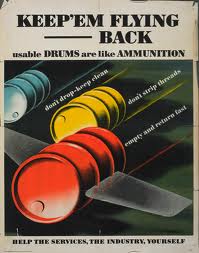
The first thing I wanted to do is recreate the background effects from the original poster because I wanted to use them in my own work. So the first one is the main paper background for the whole poster I wanted to use this in my work as it shows that the poster is aged and vintage but also printed and it gave a really nice effect around the edges of the poster. To recreate this I took the pen tool and drew round the edges of the original to get the overall shape by this I mean the little creases and tears around the page, once I had drawn round them with the pen tool I used a few different shades of brown to give the old paper effects and highlight the rips a tears more. I did this around all the edges of the orginal using the pen tool and joining up the lines so I created the rectangle shape I needed but it had details from the original poster. I then coloured in the whole thing with a final shade of brown taken from the original. This is what I got -
 To add in a few more effect I uses the line tool to recreate the creases from the original poster after drawing them out I turned them into a slightly darker colour from the main background and added gaussian blur to the lines so they were not as straight or a solid as they were. I then turned down there opacity a little so they are not as notcieable similar to the creases in the original poster.
 Finally I didn't think the background looked right because it had no texture so I borught in a old paper texture live traced it into illustrator. Placed it at the bottom of the layer behind the the background I had made. This gave the backgorund some texture and added to the vintage effect I was going for.
 The other Background that I had to create was the green and black gradient that was behind the barrels in the original at first I wasn't sure where to start but I decided to create a green background and overlay the black cloud shape onto it much like the original poster. I thought using blend should be best way to create the green background. So I created a rectangle and made it a dark green colour and then copied this rectangle and made it a lighter green colour. Then I went to object - blend and created a smooth blend between the two which made a nice green gradient between the rectangles however it was just solid colours so it did not look right so I added in the grain effect to give it some sort of texture this was the result -

I was happy with this so I moved onto created the black cloud effect in the original poster, to do this I used the pen tool to get the shape of the clouds. Once I had drawn round it I had the rough shape Next I added in a radial blur to make the edges darker and then I turned down the opacity of the layer down show the green behind shined through. i was happy with this and thought it was very similar to the original.
Overall my backgrounds looked like this -