Friday, 9 November 2012

Henry Koerner Propaganda


Henry Koerner Is the artist I am going to use as my main inspiration having already looked at a few of his poster I decided to look a little bit deeper into him and his work including the one I am going to use as my main inspration. So after some research into him I found that he was originally born in Vienna he moved to the United States in 1938 as started out as a commercial artist. During world war 2 he created propaganda poster for the Office of War Information and the Office of Strategic Services his most famous piece being the someone talked poster I have already looked at which won an award at the museum of modern art. Most interesting to me is that he was considered the master of magic realism which completely contrasts his propaganda work. Although it is propaganda it is not even a little bit realistic on the most part featuring flying barrels, floating hands and giant fish. This imagery however whilst not realistic it is very strong which is something I really like about his work. 


Another aspect of his work I really like was the backgrounds of his posters they almost always feature some kind of gradient background which is a nice touch and often makes the main imagery stand out more.  For example the poster on the right has a gradient background which makes the soldiers on the side stand out against the black background and makes the text stand out against the red on the bottom of the poster whilst also being visually pleasing. 


Another strong part of his propaganda work in my opinion is the slogans he usese in his work they are usually short, clever and get a strong message across. For example the slogan here of "Fish is a Fighting Food, we need more" is gets the message across to us but is also catchy with the three f's making alliteration feel to it making it stronger. Also often the typography on his work will feature more than one colour  to make it stand out on the background and also highlight certain parts of his slogans to give them more impact. 

(Parts of Henry Koerner's biography taken from - http://www.rogallery.com/Koerner_Henry/koerner-biography.html) 


The Crit

Today I showed my poster to the class and got there views on it overall the feedback was positive but a few points were raised on how I could improve it.  First off though people liked the overall idea and theme of the poster and the hash tag in the slogan was well liked.

Then there were a few areas of my poster that I could improve on. The main issue being the font being way too different from the original to work and keep the theme and feel of the original poster.  Everyone agreed this was something I need to change and fix for my final poster to get closer to the orignal and the time period so and looking at the fonts now I can understand and see why people raised the point.  At first I thought the font I had was not that bad and looked similar to the original but after the crit I realised it was actually really far from the original and there were much stronger choices of fonts I could use wehich mimic the original.

Another point that was raised was the background behind the birds was too static to give any sense of movement This is definately something I can improve on that would make the poster have a better look to it and take more from the original. Finally there were some black lines breaking up the colour in the twitter birds which is apparently some sort of bug with live trace so I wanted to fix this. 


So things to improve on - 

1 - Change the typography for the poster.

2 -  Give the background behind the birds some sort of blur so it suggests movement.

3 - Fix the lines in the Twitter birds. 

So overall the crit was very helpful and I was left with a number of ways to improve my poster.

Tuesday, 6 November 2012

Typography

I wanted to keep the typogrpahy he same as the original as it had a really good ww2 retor feel in my opinion so I didn't changing it would help my poster.After searching around for a little while I found this font


The Georgia font was a simple one given in illustrator anyway but it was fairly similar to the font used in the original poster which isn't flashy or that special but it gets the point of the poster across and I wanted the same for my poster also I thought is was a really good way to link back ot the original poster and the timeframe it was from.

Here is the main slogan in the font it is simple but effective for what I want it to do. 

Colour Scheme

As mentioned in the initial sketches post I wanted my colours to be sourced from the original poster so I did this using the eye dropper in illustrator building up my own swatch pallette of the colours form the poster I then added in the twitter colours to use on the birds in the page.


Here is what the colour scheme looks like so I think it will work and the twitter colours will blend in nicely as there was already a light shade of blue used on the poster so it will not looke out of place or too overpowering on the eye. The greens and the black I will blend to creat the gradinet effect from the original and the browns I will hopefully create a vintage looking poster with. The differnet shades will be necessary for the blends and gradients.

Friday, 19 October 2012

My New Idea

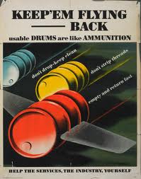
My new idea is based around the same artist of the someone talked poster which was Henry Koerner I found another poster of his which I really liked based around usable drums the imagery was strong again. 

I have changed the aspect I am promoting from poking people on Facebook to the followers aspect of twitter as I came up with some good ideas based around this. This aspect is along stronger and more current than my previous choice but it also means I can be more flexible with what I add to the poster.  The idea is to change the poster from "keep 'em flying - back" to "keep'em following" I think this will work and be a strong poster which mimics the original strongly. 

Change of Idea

I have decided to change the aspects and poster behind my idea for my propaganda poster for a couple of reasons first off the poster I chose to use as my inspiration had very strong imagery the key to this was the hand masking the newspaper report which carried the message in a very strong visual way. Now with my idea I am struggling to find something that the hand can mask which is as strong as the original because the original used a paper report about a ship sinking which had a very strong message and impact on the poster but without something as strong for my idea I don't think it will have the same effect meaning the impact will not be as great.  This is not helped by the fact that the aspect I am promoting (Facebook poking) is basically dead so it is hard to gauge why it is used and the pro's and cons of the aspect. This makes it very difficult to work out what will have an impact in the hand. 

Another reason I have changed my ideas is the colours which I am not confident will work, the original poster was dark with it's colours fitting with the message but changing these to my bright colour scheme might not work or look right. Although they may still work because my message is different but the impact and feel of the poster would have changed completely. 

Review of Pitch

I found the pitch process to be helpful to my project and helpful in a more general sense this was because it got me used to the idea of showing everyone my ideas and work and getting feedback on them. This is good as I am now more comfortable doing this and getting different opinions on what works and what doesn't in my ideas. This is where the pitch was helpful on my current project of creating a propaganda poster I pitched my ideas to the class including the research I did and the main ideas I had generated.  Overall the feedback on my pitch was positive people thought the idea was strong and would work to promote "poking" on Facebook. A couple of issues were raised these were the typography where my choice was seen as too be a bit weak as I wanted to keep the type face the same as it is very american and WW2 themed and it resembles this well. My choice was a little too different and this was pointed out in the feedback I got on my pitch so this is an issue I need to fix by finding the original font used.

Another issues that was raised was the hand and what it would mask in my poster this is something I had not made a final decision on so the feedback here was very useful giving me more ideas on what would work inside the hand. Some of the ideas were to use the Facebook homepage, the poke notifications on Facebook so this is something I need to decide on. A few more ideas were given to me in my feedback in general such as giving the man a Facebook walking stick to make the Facebook theme stronger. 

So overall the pitching process was very helpful and gave me confidence that my idea is strong but also made me think about a few of the design decisions I have some of which I now think I need to change or tweak to make them stronger.