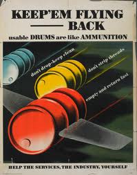
Looking at the the different screenshots the fonts were retro and and reminiscent of art deco with the shapes and different sizes they use.
I also looked at fonts with a slightly different style to vintage america this font is based on old typewriters which were used in the 1930's the same time the book is set. So because of this I thought the font would work on the cover of the book. However the font doesn't link in with the film noir feel that much and this is the kind of theme I was going for.
 This is another font that goes back too the film noir style with the uneven lines that make up the letters for example the N which shows this well with the thin lines either side of the thick line that makes up the N this is the theme throughout the font. Another aspect of the font is the curvy lines that are around some parts of the letter, it give the font a nice balance of straight lines and curves.
This font is another one reminiscent of film noir and also has an art deco feel to it. The shapes and the flowing lines made me think about the art deco movement. For example the H and the E have this overflowing effect also the lines have the uneven feel to them again similar to the previous fonts.
A finer font which has a retro feel to it the font itself is really simple but looks really clean and tidy. A bit more structured than the other type faces I have looked at as well.
The titles screens in film noir movies had a mixture of fonts that were obviously different to suit the film they were featured on.
I wanted the font I use on my book cover to be inspired by these film noir titles and be reminiscent of the time I selected a range at first that I thought would be suitable before looking at them further.
I wanted the font I use on my book cover to be inspired by these film noir titles and be reminiscent of the time I selected a range at first that I thought would be suitable before looking at them further.
The first font I looked at was manifest I thought it linked back to the film noir style well with the uneven shapes in the letters and some of the letters going below the baseline which adds to the vintage feel of the font.
I also looked at fonts with a slightly different style to vintage america this font is based on old typewriters which were used in the 1930's the same time the book is set. So because of this I thought the font would work on the cover of the book. However the font doesn't link in with the film noir feel that much and this is the kind of theme I was going for.
 This is another font that goes back too the film noir style with the uneven lines that make up the letters for example the N which shows this well with the thin lines either side of the thick line that makes up the N this is the theme throughout the font. Another aspect of the font is the curvy lines that are around some parts of the letter, it give the font a nice balance of straight lines and curves.
 This font is another one reminiscent of film noir and also has an art deco feel to it. The shapes and the flowing lines made me think about the art deco movement. For example the H and the E have this overflowing effect also the lines have the uneven feel to them again similar to the previous fonts.
A finer font which has a retro feel to it the font itself is really simple but looks really clean and tidy. A bit more structured than the other type faces I have looked at as well.
The betty noir font is the font I think I will go will it has really nice lettering and again a retro feel that looks from the 50's so it will fit the art style without a problem. But out of all the fonts it looks the best and most effective for my cover.


