The Colour scheme I have chosen for my book cover I went for a mixture of film noir and modern interpretations of Saul Bass work as these were the art styles that have influenced my book cover. I tried to mix the tow styles by using the red and blue to link back too Saul Bass' style with the grey, white and black linking in with film noir.
Friday, 7 December 2012
Art Styles - Saul Bass
By similar I meant that his drawing style of people was similar because of the way they are distorted and not all the body parts are fully connected. For example looking at the range of posters he created here you can see the people are done in a unique style, i found it interesting that you could still tell even though some of it was pretty extreme like the arm in the bottom left which is very jagged and looks very different to an actual arm.
However after looking through a range of his work I thought his style might be a little too extreme for what I wanted to and for the big sleep in general. So I started looking for different takes on Saul Bass' work and from this I found the "Catch me if you can" title sequence which is a modern take on his work and is reminiscent of the 50's with the it's colour style and the clothing on the people. Another aspect of this title sequence that I liked was that it reminded me of film noir with the men in suits, leaning against walls, wearing hats all reminiscent of film noir style. Also the colours linked back to film noir with blacks and blues and there were also some other darker colours used at different sections in the title sequence.
So I decided that this modern interpretation of Saul Bass' work mixed with film noir style would be the main influences on the art style for my cover. Tuesday, 27 November 2012
Typography
To get an idea of the type of typography I wanted to use in my idea I looked at typography associated with film noir and also typography seen in the 1930's. I did this as film noir is want I want to use as the art style for my idea so looking at the typefaces it used would give me a good idea of the type of style the fonts had, also I looked at the 1930's fonts because this is when the book the big sleep was released so using a type face based off this time period would work for the book.
Looking at the the different screenshots the fonts were retro and and reminiscent of art deco with the shapes and different sizes they use.
I also looked at fonts with a slightly different style to vintage america this font is based on old typewriters which were used in the 1930's the same time the book is set. So because of this I thought the font would work on the cover of the book. However the font doesn't link in with the film noir feel that much and this is the kind of theme I was going for.
This is another font that goes back too the film noir style with the uneven lines that make up the letters for example the N which shows this well with the thin lines either side of the thick line that makes up the N this is the theme throughout the font. Another aspect of the font is the curvy lines that are around some parts of the letter, it give the font a nice balance of straight lines and curves.
This font is another one reminiscent of film noir and also has an art deco feel to it. The shapes and the flowing lines made me think about the art deco movement. For example the H and the E have this overflowing effect also the lines have the uneven feel to them again similar to the previous fonts.
A finer font which has a retro feel to it the font itself is really simple but looks really clean and tidy. A bit more structured than the other type faces I have looked at as well.
The titles screens in film noir movies had a mixture of fonts that were obviously different to suit the film they were featured on.
I wanted the font I use on my book cover to be inspired by these film noir titles and be reminiscent of the time I selected a range at first that I thought would be suitable before looking at them further.
The first font I looked at was manifest I thought it linked back to the film noir style well with the uneven shapes in the letters and some of the letters going below the baseline which adds to the vintage feel of the font.
I also looked at fonts with a slightly different style to vintage america this font is based on old typewriters which were used in the 1930's the same time the book is set. So because of this I thought the font would work on the cover of the book. However the font doesn't link in with the film noir feel that much and this is the kind of theme I was going for.
This is another font that goes back too the film noir style with the uneven lines that make up the letters for example the N which shows this well with the thin lines either side of the thick line that makes up the N this is the theme throughout the font. Another aspect of the font is the curvy lines that are around some parts of the letter, it give the font a nice balance of straight lines and curves. This font is another one reminiscent of film noir and also has an art deco feel to it. The shapes and the flowing lines made me think about the art deco movement. For example the H and the E have this overflowing effect also the lines have the uneven feel to them again similar to the previous fonts.
A finer font which has a retro feel to it the font itself is really simple but looks really clean and tidy. A bit more structured than the other type faces I have looked at as well.
The betty noir font is the font I think I will go will it has really nice lettering and again a retro feel that looks from the 50's so it will fit the art style without a problem. But out of all the fonts it looks the best and most effective for my cover.
Monday, 19 November 2012
The Big Sleep Imagery style
(Definition taken from - http://en.wikipedia.org/wiki/Film_noir)
Although film noir is a style of cinematography I was more interested in it as an art style.
As you can see from the definition film noir was based around and inspired from the hardboiled crime novels and because of this the imagery associated with the big sleep is often based around film noir. The characters fit the stereotypes from this film style as well as this the story is moody and atmospheric another key aspect of film noir. On top of this the story is American and although set before the film noir style happened the imagery and the style of the book fits. The lack of images in the book mean people will interpret the different scenes and described imagery in there own way but in my opinion it all leads back to the film noir style.
For example this image of a man from film noir could be anyone as it is not specified but it could easily be seen as detective Marlowe from the book as it suits his characters completely showing the stereotypes of this style. This one being the gritty detective and the other stereotypes being deadly dames, drunken losers, dangerous hoods, crooked cops, dreamers of broken dreams, and flawed heroes.
All of these match up to the characters from the big sleep for example Carmen matches the deadly dame and the bad guys from the book like Geiger match the dangerous hoods stereotype even if it is loosely. This started to create the imagery in my head of these different characters and the different scenes all in the film noir style. The story as well fits into the film noir style as it involves treachery and hidden secrets which are aspects of film noir style plots.
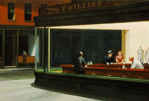
Also artists from this time have a distinct style such as Edward Hopper his most famous piece of art being his painting entitled nighthawks which is meant to capture a lonely night scene in america painted in 1942 it was painted just after the period where the big sleep is set (1930's) it is a restaurant scene where the art style is very reminiscent of film noir movies. Looking at the existing book covers
To get an idea of the sort of covers that these books already had I decided to look at a number of there existing ones in the hope of finding some inspiration.
First off I looked at book covers for the wind in the willows and the key themes that stood out were the nature scenes being used as the main imagery linking with the green colour schemes as well as the at least on of the four main characters being visible. Like this cover here for example the colours are bright and colourful which works well for the target audience as this is a childrens book, the target audience will be also be attracted by the animal characters previously mentioned. The cover shows a nice scene and the viewer can see that the animals are friends and gives a calm feel to the cover. This cover works well but the rest of the covers I found are very similar so there's nothing that original or standout, most covers feature the boat and the characters as mentioned above.
The colour schemes also change a little but the majority are just a mixture of greens to go with the different outdoor scenes on the numerous covers. There were a few covers that stood out a little though as they moved away from the river bed scene.
This one for example shows the characters arriving at toad hall together the imagery is specific and shows a key elements from the book such as the characters, the car and toad hall. It also shows part of the story as well as key elements I think this cover works as it shows who's in the book and also suggests what it is about. For example the mansion and the car play a big part in the story and obviously the characters do as well. As mentioned above it moves aways form the river bed scene so the colour feature less green and more browns it is still colourful but not as colourful as the previous cover.

This cover is the other cover that stood out to me as the colours are completely different from the ones above, this is because it moves the scene of the cover to part of the story where badger is met in his snowy cabin. This meant the greens from previous covers don't feature which is good as it mixes it up when looking at the covers together. The cover art style is also not as cartoony as the over covers adding a more serious feel to the book. One thing about this cover however is even though it is a scene from the book it gives off a christmas feel with the snow and the attire in the cover at least to me make it seem like a christmas story.
Overall however looking at these covers the ideas behind them are taken from key parts or scenes of the book and all feature at least one character. Because of this the different covers work for the book however a lot of the covers are pretty similar featuring the character the boat and the river bed, so I found the art style of the drawings to have a big impact as to which cover you prefer.
The Big Sleep covers -
The other choice of book was the big sleep which had a very different style of book cover to the wind in the willows and looking through a range of covers for the big sleep it was interesting to see the range of art styles and covers. They ranged from film noir style to cartoon style drawings, there was also a mix of colours used throughout the covers. The imagery of the covers was similar however all using character, items or scenes from the book, the cover on the left for example we know the man is detective Marlowe from the book. This particular cover uses the film noir style with the atmospheric feel the emphasis on the smoke as well as man looking like a generic detective from film noir cinematography. This cover also has a more serious feel than some of the other covers I looked at this comes a real photo being used also with no expression visible from the man it aids a sense of mystery to the cover.

This cover greatly contrast with this one above with a completely different feel and look using bright colours and hand drawn imagery. This cover moves away from the film noir style and gives more of a classic feel as a murder mystery the gun however does keep a level of seriousness to the book cover. Also the hand drawn style is more eye catching than the photo because of the colours and the size of the imagery the gun is central on the cover and red colour contrasts with the yellow.

This cover is a mixture of the other covers I have looked at above in my opinion because it combines the film noir style with hand drawn imagery. The colours really compliment each other well and the red doesn't overpower the grey or change the fell of cover to dramatically. It is also not a bright red so it fits the gritty film noir theme of the cover and could be interpreted a blood. The imagery used on the cover works really well in my opinion and the man in the trench coat is obviously the main detective character also the positioning so he goes under the red square which works well in covering it up rather than blacking the face out. I really like this cover as the cartoon art style has been mixed with the film noir style and I think it works really well.

This is the original book cover of the big sleep very simple probably because it was designed in the 1930's when the book was published. The colour scheme of the cover is basic with three colours being red, blue and white the typography is interesting however as it appears to float above the cover with it's shadow underneath the perspective is also add to the floating effect in the way it is positioned.
First off I looked at book covers for the wind in the willows and the key themes that stood out were the nature scenes being used as the main imagery linking with the green colour schemes as well as the at least on of the four main characters being visible. Like this cover here for example the colours are bright and colourful which works well for the target audience as this is a childrens book, the target audience will be also be attracted by the animal characters previously mentioned. The cover shows a nice scene and the viewer can see that the animals are friends and gives a calm feel to the cover. This cover works well but the rest of the covers I found are very similar so there's nothing that original or standout, most covers feature the boat and the characters as mentioned above.
The colour schemes also change a little but the majority are just a mixture of greens to go with the different outdoor scenes on the numerous covers. There were a few covers that stood out a little though as they moved away from the river bed scene. This one for example shows the characters arriving at toad hall together the imagery is specific and shows a key elements from the book such as the characters, the car and toad hall. It also shows part of the story as well as key elements I think this cover works as it shows who's in the book and also suggests what it is about. For example the mansion and the car play a big part in the story and obviously the characters do as well. As mentioned above it moves aways form the river bed scene so the colour feature less green and more browns it is still colourful but not as colourful as the previous cover.

This cover is the other cover that stood out to me as the colours are completely different from the ones above, this is because it moves the scene of the cover to part of the story where badger is met in his snowy cabin. This meant the greens from previous covers don't feature which is good as it mixes it up when looking at the covers together. The cover art style is also not as cartoony as the over covers adding a more serious feel to the book. One thing about this cover however is even though it is a scene from the book it gives off a christmas feel with the snow and the attire in the cover at least to me make it seem like a christmas story.
Overall however looking at these covers the ideas behind them are taken from key parts or scenes of the book and all feature at least one character. Because of this the different covers work for the book however a lot of the covers are pretty similar featuring the character the boat and the river bed, so I found the art style of the drawings to have a big impact as to which cover you prefer.
The Big Sleep covers -
The other choice of book was the big sleep which had a very different style of book cover to the wind in the willows and looking through a range of covers for the big sleep it was interesting to see the range of art styles and covers. They ranged from film noir style to cartoon style drawings, there was also a mix of colours used throughout the covers. The imagery of the covers was similar however all using character, items or scenes from the book, the cover on the left for example we know the man is detective Marlowe from the book. This particular cover uses the film noir style with the atmospheric feel the emphasis on the smoke as well as man looking like a generic detective from film noir cinematography. This cover also has a more serious feel than some of the other covers I looked at this comes a real photo being used also with no expression visible from the man it aids a sense of mystery to the cover.

This cover greatly contrast with this one above with a completely different feel and look using bright colours and hand drawn imagery. This cover moves away from the film noir style and gives more of a classic feel as a murder mystery the gun however does keep a level of seriousness to the book cover. Also the hand drawn style is more eye catching than the photo because of the colours and the size of the imagery the gun is central on the cover and red colour contrasts with the yellow.

This cover is a mixture of the other covers I have looked at above in my opinion because it combines the film noir style with hand drawn imagery. The colours really compliment each other well and the red doesn't overpower the grey or change the fell of cover to dramatically. It is also not a bright red so it fits the gritty film noir theme of the cover and could be interpreted a blood. The imagery used on the cover works really well in my opinion and the man in the trench coat is obviously the main detective character also the positioning so he goes under the red square which works well in covering it up rather than blacking the face out. I really like this cover as the cartoon art style has been mixed with the film noir style and I think it works really well.

This is the original book cover of the big sleep very simple probably because it was designed in the 1930's when the book was published. The colour scheme of the cover is basic with three colours being red, blue and white the typography is interesting however as it appears to float above the cover with it's shadow underneath the perspective is also add to the floating effect in the way it is positioned.
Friday, 16 November 2012
Brief research into the books
After reading through the brief I was not sure which book I should base my project on so at first I decided to take a brief look into each book.
So -
The Big Sleep - Is a hardboiled crime novel based in 1930's America written by Raymond Chandler. The story is about a detective named Phillip Marlowe working for the rich Sternwood family dealing with a blackmailer the story however becomes much more complex as characters begin to double cross one another. The book comes across as very film noir and the the characters are all stereotypical especially Detective Marlowe as he is tough, gritty, clever and also honest. The key themes in the book are corruption in American seen in the characters and the American depression as Marlowe mentions money as an ideal throughout the book.
The Wind In The Willows - Is a classic children's book written by Kenneth Grahame, the story is about four animal friends a badger, a rat, a mole and a toad, the story is based on the animals friendship and concern for toad who is reckless and always getting into trouble. For a children's book some of the themes are more sinister than you would expect showing the consequences of toad's reckless obsessions.
So -
The Big Sleep - Is a hardboiled crime novel based in 1930's America written by Raymond Chandler. The story is about a detective named Phillip Marlowe working for the rich Sternwood family dealing with a blackmailer the story however becomes much more complex as characters begin to double cross one another. The book comes across as very film noir and the the characters are all stereotypical especially Detective Marlowe as he is tough, gritty, clever and also honest. The key themes in the book are corruption in American seen in the characters and the American depression as Marlowe mentions money as an ideal throughout the book.
The Wind In The Willows - Is a classic children's book written by Kenneth Grahame, the story is about four animal friends a badger, a rat, a mole and a toad, the story is based on the animals friendship and concern for toad who is reckless and always getting into trouble. For a children's book some of the themes are more sinister than you would expect showing the consequences of toad's reckless obsessions.
Monday, 12 November 2012
AF101 - The New Assignment
Today I was handed the brief for the new assignment titled AF101 Visual Communication for this project we have asked to create a book cover for the penguin design award competition. There are two books too choose from for this project the adults book 'The Big Sleep' and the children's book 'The Wind And The Willows'
For this project I must produce -
- A Sketchbook
- A Blog
- A Book Cover Design (using illustrator, photoshop and inDesign)
- An A2 poster based on my cover design
- A set of branding guidelines for my cover and poster
- A short statement to accompany my designs showing an understanding of visual communication considerations.
For this project I can also use the brief taken from the penguin competitions website -
- The Big Sleep - http://www.penguin.co.uk/static/cs/uk/0/minisites/penguindesignaward/penguin_brief.php
- The Wind In The Willows - http://www.penguin.co.uk/static/cs/uk/0/minisites/penguindesignaward/puffin_brief.php
Subscribe to:
Posts (Atom)